I have no idea what any of that is about, but the Baroness certainly looks a lot more interesting than Cobra Commander. I’m not even going to bother learning about their political stance and what they stand for, I’m voting for the picture I like best. Such is politics! Hooray democracy!
quite neat. Plus, if the player is faced with some of those “cutscenes” requiring user input, to have some arrow button or something in place of the hidden bottom text input and instead of just the text (that not always includes “type something to go on”).
I think these are reasonable interface guidelines that users nowadays have come to expect from chat-like applications or games…
potential to reach a wider audience? Just like nicer fonts in book style rather than butt-ugly monospaced white fonts over black blackground?
OTOH, changing it to become completely chat-like might add to that illusion of complete freedom to chat with the game and frustration. At least until getting to grips with the format…
I’d be glad just for an ever blinking cursor when I send parchment links and perhaps that “continue arrow” during cutscenes.
I’m still not sure we should pander to chat-style applications and their users. IF just isn’t a chat program. For one thing, spelling is important…
hey, it works both ways 
I’m thinking of mobile platforms specifically. There are almost no mobile apps where you enter text and receive a response in the same panel: there’s always a dedicated entry field, often with placeholder text telling you what it’s for.
In that model, the standard prompt is superfluous, and unique prompts could be shown in more appropriate ways. For example, a yes/no prompt would work better as buttons, and a tutorial prompt (“what are you, the detective, gonna do about it?”) might work better as a separate paragraph or a popup hint.
As I believe someone said earlier, isn’t this merely a coincidental problem (if we stipulate it as a problem at all)? Is it implausible to make an interpreter “customized for you, the mobile phone user,” which addresses the issue in that context should some hypothetical person find traditional prompt styles confusing?
Not that I agree that many people are likely to find the traditional style confusing, nor that the interests of such persons deserve equal weight to the interests of those already familiar with current interfaces. I’m just saying, this whole thing seems like a false dilemma, so for the sake of argument, is it correct to say the issue is easily resolved if we wish?
There are also almost no games nowadays where you have to type commands in. But I see your point, snarkiness aside.
Yes/no prompt as buttons… Tutorial prompt (I’m reminded of Infocom’s “Arthur”, which did diferentiate between parser errors and other messages, something that just didn’t catch on though it wasn’t a bad idea)… You’re the programmers here, is that doable on interpreters with the available opcodes et al? I mean, would taking a step in that direction mean a whole shift in paradigm or, at least, need for Inform 7 to start adding new stuff… or are there enough hooks that an interpreter author can get to work and actually make this as it is? Or would it necessitate a plug-in extension, like Vorple and FyreVM do? Heck, David C is often popping in at various discussions to say “Actually, FyreVM could easily do that thing you’re talking about” - could it also do this, d’you think?
Essentially, I’m saying - it’s unlikely this will change if it requires a change to the existing framework, because not only does the existing framework work well, people are used to it and some parser tricks have been written around it and to accomodate it. BUT, if this change is actually possible now, though not completely, it might be best to put it into practice by people who agree that it’s an issue that needs to be resolved/addressed.
Namekusejin linked to the IFTech Foundation. That’s probably not a bad idea. Maybe someone should formally make the suggestion, somehow.
my only puzzlement is why didn’t we keep the 80x25 monospace aliased fonts too…

why exactly was gorgeous font styling adopted for slick presentation of IF content, but we still cling to a 70’s style console terminal text cursor for input rather than a modern text input? what kind of reasoning is beyond those choices?
Who’s clinging to the 70’s?
I can only speak about Parchment, but I haven’t been aiming for any nostalgic interface. I feel much more affinity with modern zero or minimal interface apps like Svbtle:

Adding, after a short delay, some kind of placeholder or tooltip that will alert the user that we are waiting for their input is already on my to-do list, but as with everything else, time is limited. Pull requests are always welcome though 
And it would also be very easy to make the text box more explicit for any authors who wanted to do that for their stories. It’s just CSS.
but it was just a suggestion and observation. Getting rid of > just means getting it from the main text output pane and putting it below that, but still echoeing all actions up there - reflecting a more modern user interface metaphor. I don’t understand how that’d hurt so much…
Hmm, because a separate input pane is so modern…
Okay, to be fair, they aren’t echoing the input in the main window. But most of these interface ideas have been tried before. None are indisputably better than any others. And I like Parchment’s seemless design 
1 Like
One more thing: the Glk standard anticipates and says that split pane input is perfectly legal:
In line input, again, there will be some visible signal. It is most common for the player to compose input in the window itself, at the end of the text. (This is how IF story input usually looks.) But it’s not strictly required. An alternative approach is the way MUD clients usually work: there is a dedicated one-line input window, outside of Glk’s window space, and the user composes input there. [If this approach is used, there will still be some way to handle input from two windows at once. It is the library’s responsibility to make this available to the player. You only need request line input and wait for the result.]
they indeed were - including some incredibly klunky ones from early graphical adventures with verb list panes, inventory panes, compass rose panes, graphical pane and so on.
But I’m not concerned with the way it’s been used in IF before, I’m more concerned with how a modern day computer user casually messing around - and hopefully getting hooked to - with IF might wonder what to do next when a relic from seventies computer terminals might give no clue.
truth be told, this started out as a rant just because the text cursor next to > does not blink except when the user click on it in parchment. So, some people might really be missing that they should type something there, like they would in a chat program.
I’ve send a couple of links before, one to parser IF and the other to a cyoa and the result is almost always the same: people tend to comment on the cyoa. It might be that it is just easier to tap away links and choices in the cyoa, no doubt. But the fact that the parser IF usually generates no kind of response at all - either angry or I don’t like it - makes me fear that that > thing (without a cursor blinking) just gets completely over their heads.
when you look at text interfaces today, blinking is not always needed if the user already knows that you are to type something there: web forms, the URL bar, the text input at the bottom of a 2-pane chat program. But when it comes to text ending in >, I don’t suppose they get it.
I may be wrong and they all just hate parser IF with a passion and love cyoa instead…
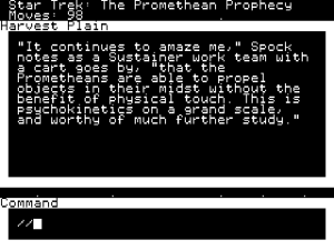
I feel that no presentation is going to please everyone and this thread has basically come to the same conclusion. Personally, I think Gargoyle and Parchment are pretty great providers of “pretty IF.” What I’d actually like to see is a ScummVM-esque multi-interpreter that provides a console-esque experience, one with a fixed window and defaulting to font sizes that would provide 80 columns.
I’m glad it exists and the world is better for it, but I feel “pretty IF” doesn’t demand my attention as much and there’s nothing wrong with also catering to those that enjoyed the old experience from back in the day.
to each his own, no doubt. But while older folk or retro fans may crave for the “authentic feel”, I fear IF is to get itself painted in a corner if unable to cater for newer audiences and such audiences are not really into 80’s terminal emulation. Unless you posit that IF is really just retrogaming and thus it makes no sense for pretty IF presentation and no sense for people without nostalgia to be playing them at all. I do actually agree on that for most of the 80’s primitive dungeon-crawling treasure hunts.
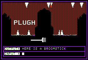
just yesterday, BTW, I browsed archive in the classic pc games collection and tried to run Adventureland on the apple ][ emulator in javascript presented. It really did have that retarded, almost unreadable font? guess part of the fun was even decyphering what was written…
To me, it’s not really about nostalgia or keeping-it-retro as it is that a screen full of giant (by today’s standards) text feels more like a game then just another text window competing for attention among Google News articles or whatever else I have open on my desktop.
To achieve all that you’re asking for, I imagine the optimal solution is creating an entirely new language/system that goes even further in regards to interpreter presentation options, which is an even harder task when you have to make everything as accessible as possible to non-programmer authors. As the usual case with IF, unless you pay someone to make it for you or are able to code such a thing yourself, you’re going to have to get by with the tools you have. All things considered, a lot of people have done a lot of great work.
2 Likes
wut?
all I’m asking for is for either the cursor to be blinking when presented a parchment link or to hide it and adopt a 2-pane, chat-like interface. Because the latter is a common, modern computer interface and even used in some IF terps to play zcode games.
regarding huge text, you can always zoom up in browsers… I do however like the literary aspect of IF to have its proper impact in normal fonts.
Well, I don’t know what browser you are using, but I just opened a game in Parchment in Firefox just today and the cursor was there, blinking, without me having to do anything.
I’m just saying that the other thing could conceivably involve library and interpreter hacks to work perfectly which is a lot to ask for from a community that is (mostly) happy with the status quo (unless you are offering to go provide the interpreter yourself).
probably wiser just hacking the current open-source ones…
anyway, no blinking cursor in either ie or chrome. It only starts to blink when you type something. It’s a minor tidbit and probably didn’t demand this huge discussion, but one tidbit I really believe has an impact on people presented with a parchment link.
anyway, can’t promise anything, but I’m taking a look at the code…
Well, good luck. You’ve also inspired me to play with the Gargoyle configuration to see if I can set up my ideal look since it already lets you set the default column and row width. I wish I knew my favorite fonts off the top of my head!
The Glulx ports of Rod Pike’s Dracula have some old-school fonts, I believe, as does ANDROMEDA 1983. Could be a place to start. 
Well, for me, I’m not trying to emulate actual console fonts. If I wanted the full experience, I would just play games with console interpreters. It’s mainly about the screen text/space ratio. I’m probably just going to go with Liberation or Linux Libertine or something.